![]()
![]()
These comments, and those in the next two pages, are mostly aimed at the amateur who would like to think a little about typography. I hope that professionals will find them of some interest, but I wrote them because I think most of the discussions available, on and off the web, are either pitched at what we might politely call an introductory level, or make large assumptions about the level of background knowledge the reader has. Nothing wrong with either approach, of course, except when they are confused, but I have tried to aim this somewhere in the middle.
![]()
Screen fonts are not the same as printed fonts, and for very good reasons. Screen fonts have to be read at 72 dots per inch, or something quite close to that, while digital printed fonts were designed for more like 2400 dpi. Naturally, there is compromise at lower resolutions; 600 dpi, the resolution of modern laser printers, is about where typographic detail starts being rendered accurately. When it comes to a mere 72 dpi, the poor type designer only has a tiny number of pixels to play with.
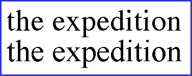
What I am saying may become clearer if you compare the compromises chosen by two different designers trying to represent what is essentially the same face. There are four-line samples of the Apple and Microsoft Times (actually, Monotype and Linotype, licensed by Apple and Microsoft) on the Tune-Your-Browser page; here are two words of each, as a screen shot at 60-pt, in other words five times the size:
![]()
![]()
They are not quite identical, but they are very similar. The 'x' is notably different, but most of the other letters vary a little too; this happens all the time, as different designers make versions of what are admittedly and intentionally the same basic font. Shown one without the other, anyone in the trade would pick it as Times, but it would take a real expert to pronounce with certainty which version.
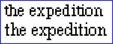
Even at 60-pt, you can see some jagged edges, which are roughly what you would see if you put 12-pt 360-dpi (good inkjet or poor laser printer) output under a 5x magnifying glass. Naturally, the jaggies get much worse if you put 12-pt 72-dpi screen output under the same magnification.
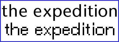
Here are the same two words, in the same fonts, in 12-pt, blown up five times:
![]()
![]()
Essentially, the designers are trying to make their 12-pt look as close as they can to that 60-pt, except that each pixel is five times the size; it's impossible, of course, and that's where the compromises come in. The interest here is how much more different these samples are than those above.
Notice how the Microsoft version (the bottom one) takes up more space, both by extending the ascenders and descenders by one pixel and by making the 'p' and 'd' one pixel wider, which allows the suggestion of a curve; the 'h' and 'n' each have one pixel lowered and the 'n' has one black one added. Meanwhile, the 't' has one pixel of space added to it on the right, and one black one at both the top and bottom of the vertical stroke.
Incidentally, the 'x' which is so different at 60-pt, is identical in this version, except that in the bottom one it sits one pixel closer to the 'p' which is strange because the bottom one is generally wider.
Yikes! On such incredibly nice decisions rest the legibility of a font on screen.
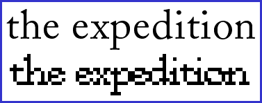
Adobe Caslon also looks very different on screen than on paper. (Most fonts do.) Here are the 60-pt and 12-pt x5 versions of the same words in Adobe Caslon (in this case, the 60-pt version uses 'smoothing' to blur the edges even further):
![]()
![]()
The bottom one is horrible, isn't it? Which is a shame, because Caslon
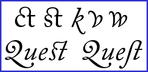
is a beautiful typeface and has a wonderful collection of ancillaries, including
such niceties as the delightful 'ct' ligature and two different 'st' ones,
along with a full complement of swash capitals and various other alternate
characters. Old-fangled, to be sure, but lovely. Just for the heck of it,
here are a few of them, still at 60-pt and just as Word lets me type them,
with ATM smoothing on but no fancy tricks or space clean-up performed:![]()
![]()
Finally, take a look at the same words as before, same setup as the first
Caslon example, in Stone Sans:
![]()
![]()
To my mind, this works much better than Times or Caslon (or most anything else), if only because the challenge is much easier to meet. The simplified lines of the design lend themselves to the crudities of 72 dpi. Of course, it still looks bad blown up. The designer here went for a wider, more expansive look, which fools the eye into thinking that the curves are smoother; at least, that is what I think is happening.
Not having serifs, especially at the bottom of the letters, makes the overall effect cleaner. In high-resolution work (like printing, which was originally effectively infinite resolution), serifs work beautifully to guide the eye along and add a flow and unity to the combinations of letters that are individual words, besides contributing to the overall color of the page. In this low-resolution universe, however, I think the serifs clutter it up. Certainly, in high-resolution, serifs are usually noticeably thinner than the main body of a letter (take another look at that Caslon), while here, unfortunately, we are reduced to On or Off; I choose Off.
![]()
Type is one of those subjects that gets deeper the more you look at it, and typographers would be quite right to complain that this has been an over-simplified look at the surface of a small part of it. But it's here to encourage people to use their eyes.
When you find a typeface you like, enjoy it!
![]()